Khaya
A quick-turnaround brand refresh for an independent interior design studio, bringing a more considered, contemporary feel to an identity that had become dated and lacked creative expression.
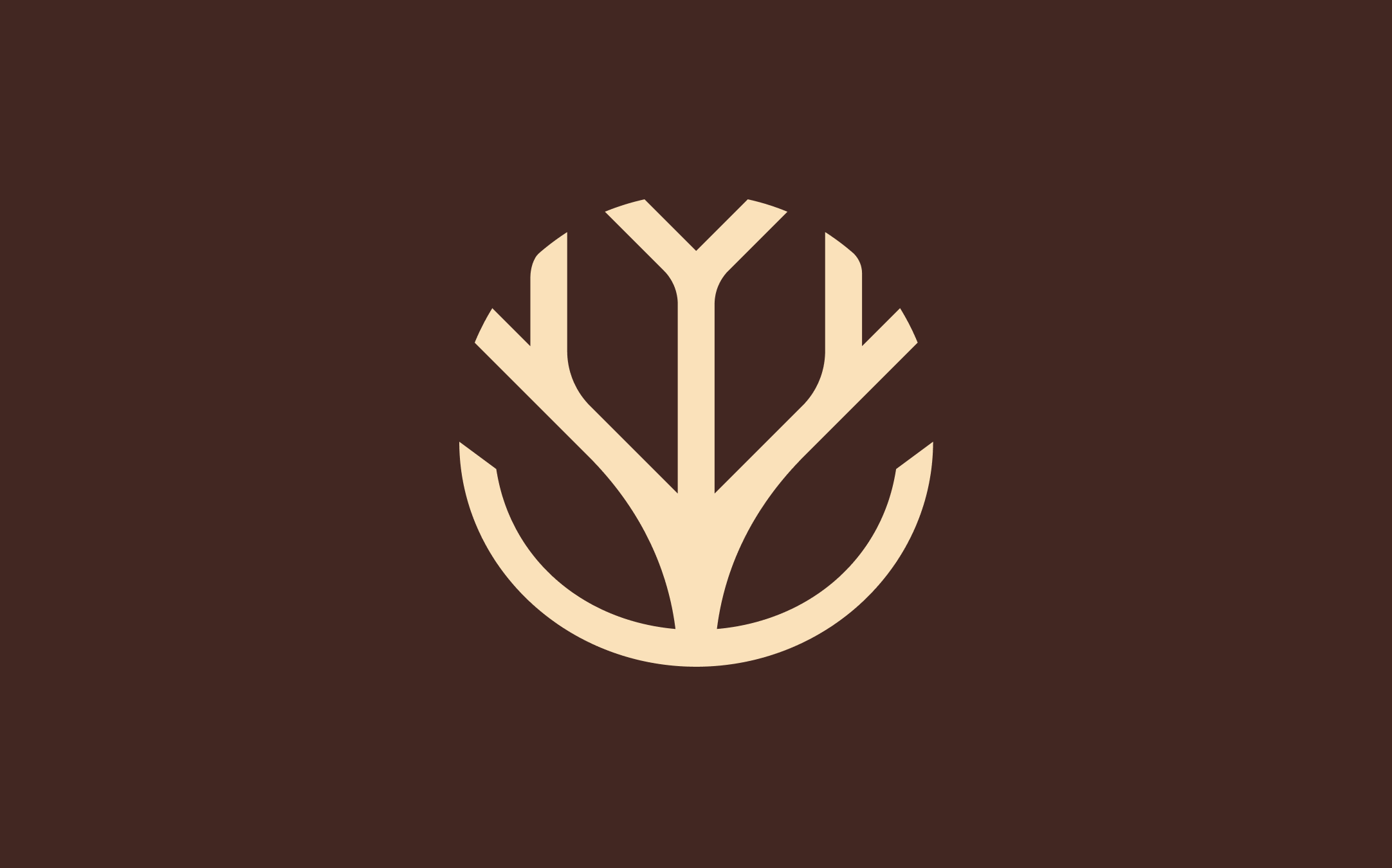
The goal was to modernise the brand while creating a stronger connection to the meaning behind the name, Khaya. Meaning “home”, Khaya also references the central pole or tree at the heart of a traditional homestead, representing community, support, family and a sense of belonging.
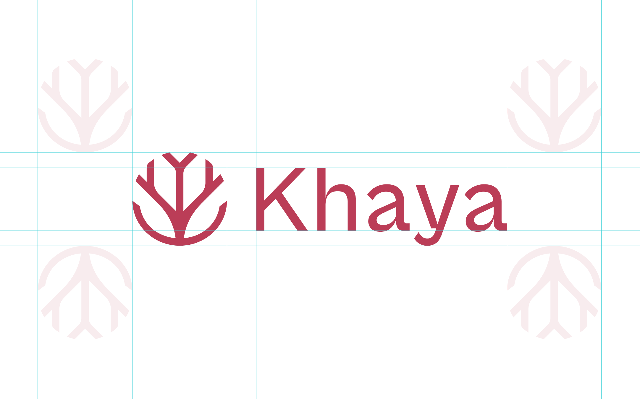
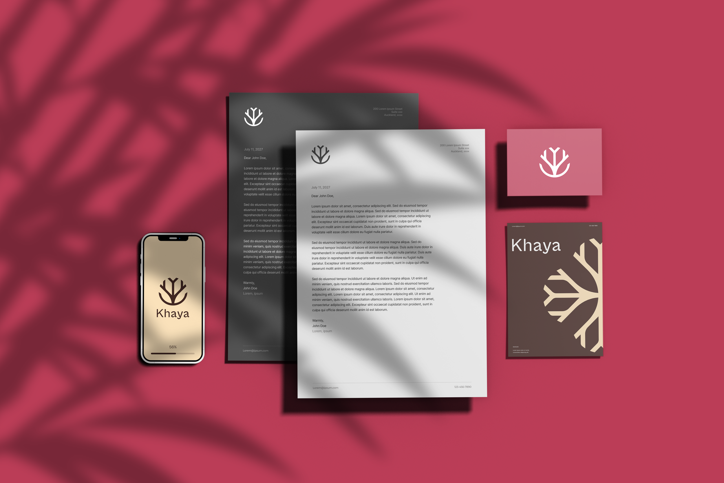
This idea became the foundation for the new logo mark and creative direction. From there, the identity was shaped by getting to know the client, understanding her approach to design and bringing her personality and ethos into the visual language.
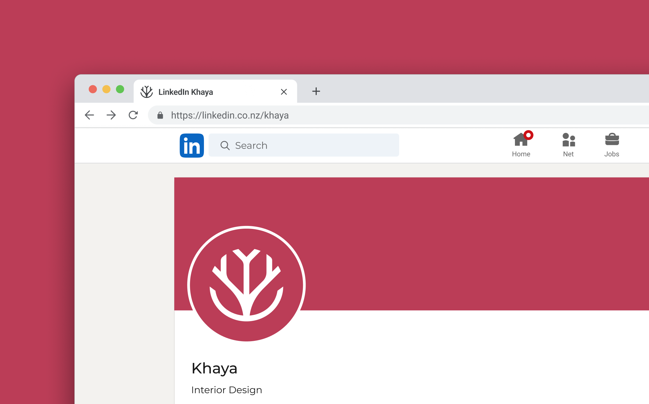
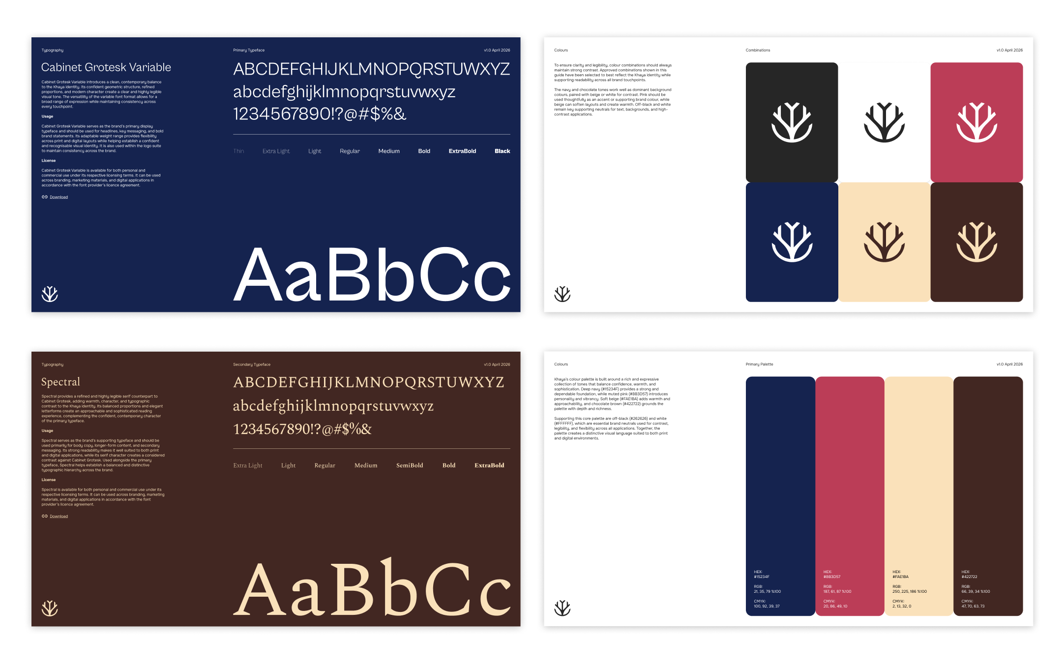
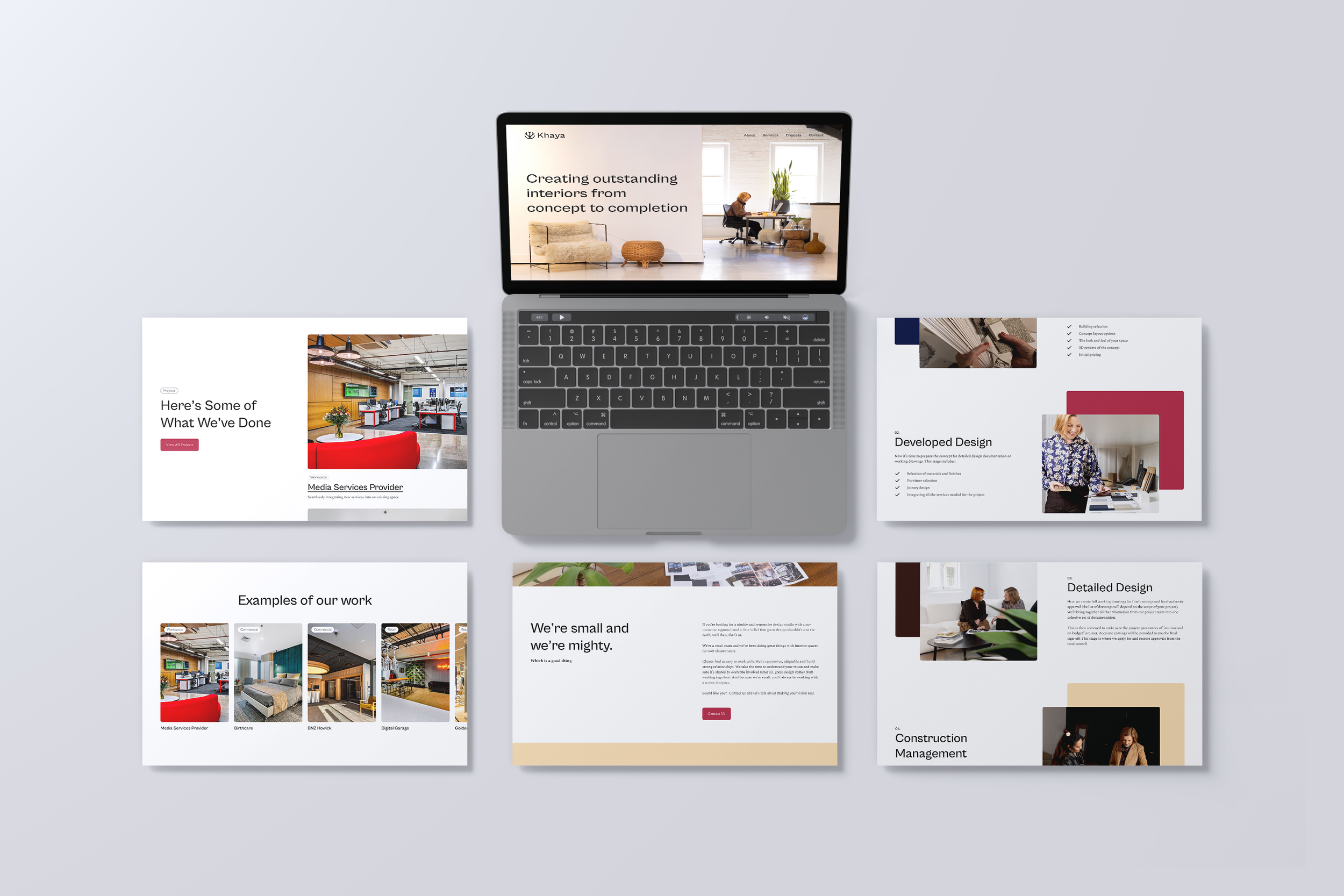
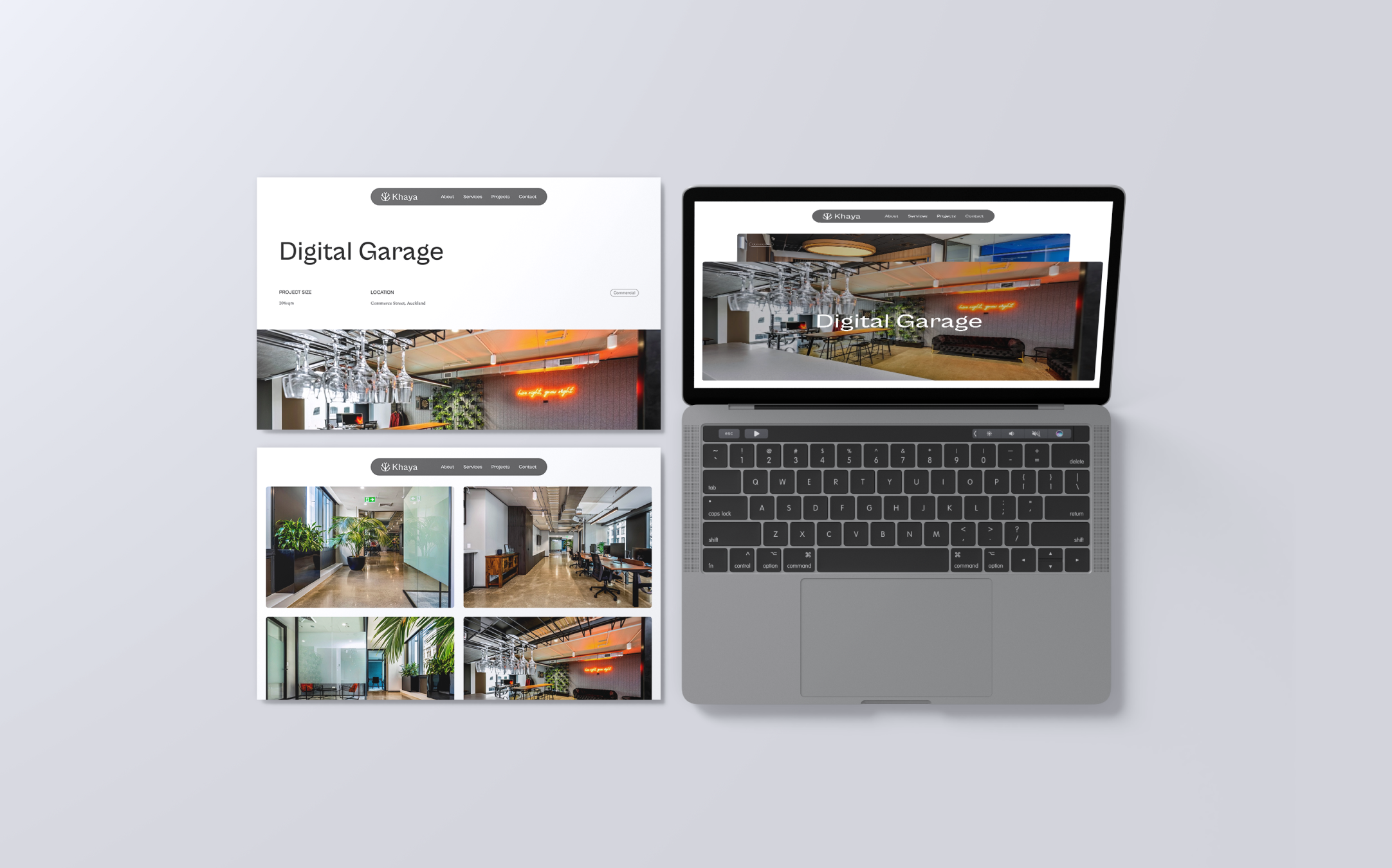
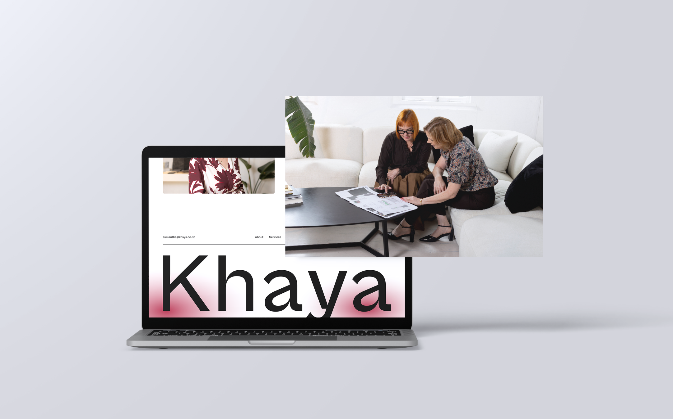
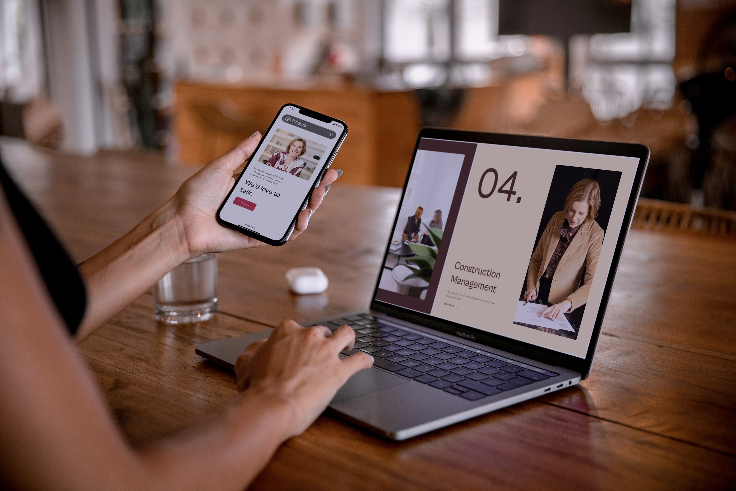
A warm, approachable colour palette, considered typography and a refined layout system came together to create an identity that feels friendly, welcoming and professional, while giving Khaya a much stronger sense of personality and purpose.



More examples